Takeaway: These test results are somewhat counterintuitive, and the key is that if you tend to have small call-to-action buttons, you may need to enlarge them but not without limits. Also, they need to show up in the place people expect them. These can be three obvious next steps the visitor to the site might want to take, rather than 10 that they “could possibly” want to take. Having 10 emphasized next steps is lazy information architecture; take some time to clarify the most important options and do that work for the user, then give them the other less important options in a de-emphasized way.
Here are 5 tests that changed the way I design websites.
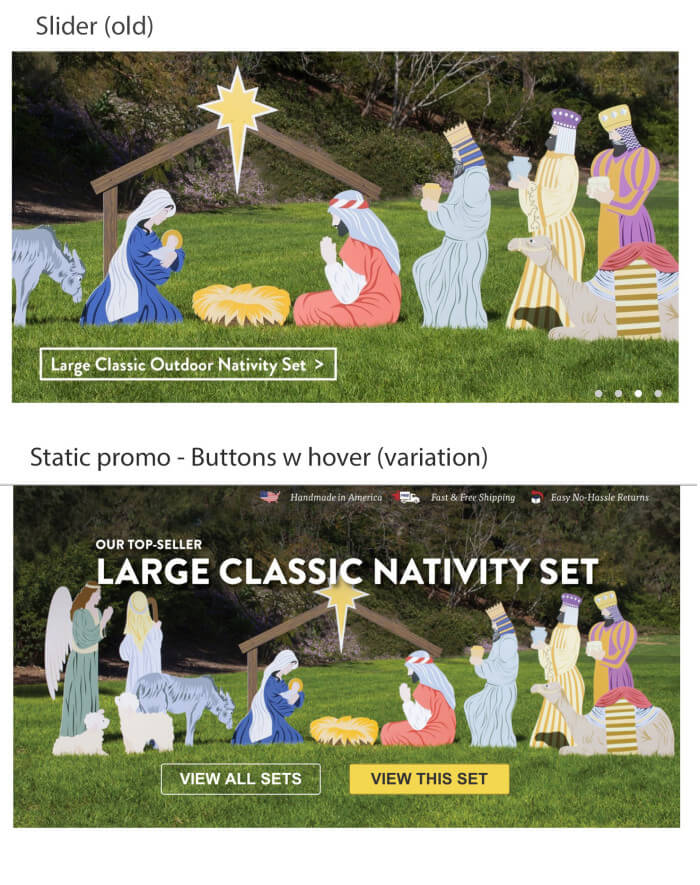
1. Replacing a slider with a static image promo of the highest selling product and buttons with hover states improved conversions by 30% (with statistical significance of 98%).
He talks a bit about other ways he increased conversions or tested things that didn’t work. Using “Create My Account” did 30% better than “Create Your Account,” and I take this to definitely mean that I should use first-person perspective for these calls to action as much as I can. It makes for much higher converting CTAs.
What are your thoughts? Feel free to share your experience in the comments section below.
I’ve gotten into designing websites with user experience testing as my focus initially and evolved my process into making design decisions based on analytics as well. Both are rich with insights that can’t be overlooked, but A/B testing is a third pillar of actionable insights that I’ve grown to love.
This is potentially contentious amongst designers, but the test in question was conducted on Caffeine Informer and was run in 2014. For all intents and purposes, the word “menu” with an outline and the three-line icon with the word menu and an outline performed significantly better than just the three-line icon.
Takeaway: Make sure your call-to-action button contrasts with the rest of the site in some way—even if that means it’s red.
Takeaway: Remove sliders in the key home page promotion area, and encourage clients to use this to tell their story or promote high-selling products or key services instead. Another big takeaway from this experience is that A/B testing something is a lot more compelling to clients than talking about “best practice” or encouraging ideas based on other things I’ve read.
[Tweet “Are we ready to use the 3-icon “hamburger” without the word “menu”? -@timbdesignmpls #cro”]
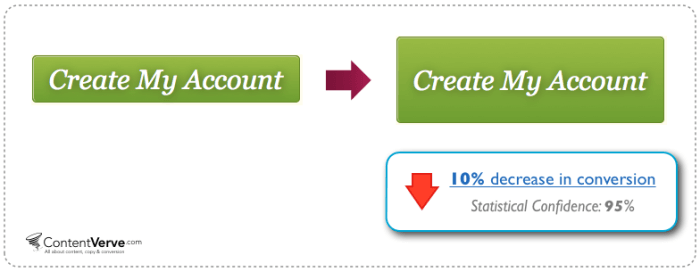
2. Making the “Add to Cart” button bigger and more in-your-face decreased conversions.
This will likely factor into the way I design websites from here on out: If there’s a point of contention, just having A/B testing in my arsenal of ways to test hypotheses and is huge to help the project get to the strongest solution.
Performable increased conversions by 31% when it tested a call to action that was red when the rest of the site was green. The keys here are that if you choose the right red, people don’t necessarily perceive it as “stop,” and that you should always choose buttons that contrast with the rest of the elements on the page.
Michael Aagaard on Content Verve experienced similar results when making his button bigger unnecessarily.
So where are we with the mobile menu in 2015: Are we going to just use the three-icon “hamburger” icon yet? Or do we still have to supplement it with a word menu? Tests are highly varied; ConversionXL says that the icon plus the word menu is the highest converting variant.
(What?!) It just wasn’t where people expected it: They expected this button lower on the page after some information about the product and not right underneath the title.
I was happy to realize that there are other people who have experienced this. Yes, even after all those years of the conversion rate optimization experts saying, “Let’s make that CTA bigger,” it turns out that making the call-to-action bigger and more prominent seems to have an opposite effect in some situations.
The issue is that people perceive sliders as if they are ads, thus they don’t interact with them, especially if there aren’t ways to easily navigate on the slider or if the navigation is tucked away.
When we design at my agency, we start with what these attention-grabbing colors will be only for the most important next steps on the page. Not a bad idea to work into your workflow when you’re creating new websites, but also develop this idea even further with A/B testing as great design doesn’t always mean that it converts!
[Tweet “Remove sliders in your home page, use it to tell your story instead. -@timbdesignmpls.”]
3. Making a button color contrast directly with the rest of the elements increased conversions by 31%.
When you have more copy to accommodate (Michael tested a larger button with “Create My Account” and “Get Started” and that one did very well), then a larger button does indeed make more sense. Just don’t make it look spammy.
This test did what I thought it would do, but the key here is having more direct evidence to help steer this client and others away from sliders on their home page. I’m not the only one who’s had this experience, and I’ve read plenty of case studies with similar results.

Takeaway: For the time being, I’m including the word menu in all the websites I work on unless I test an alternative on that specific website. Likely for newer technologies, or products or services where the bulk of the demographic are on the web a lot, you’d think the three-line/hamburger icon by itself would be fine, but A/B testing can make it clear that our hunches don’t always translate into reality.
4. Removing in-depth categories on the home page increased conversions by 7% (statistical significance over 99%).
If you are ready to experience Convert Experiments, we invite you to start your 15-day free trial.
James at Exis Web’s Test in 2015 states replacing the button with the word “Menu” doesn’t seem to be increasing interaction. And one test for Booking.com users found the hamburger icon performs just as well as the more descriptive version.
5. Including the word “Menu” in the menu button vs. the ubiquitous “hamburger” or three-line icon increased conversions by 12.9%.
In my case conversions dropped by 13% when I included the “Add to Cart” button right below the title of the product and above the description. I also see this as another indication that “above the fold” is not as important when it comes to web design.
Rotating banners are absolutely evil and should be removed immediately. -Tim Ash, Site Tuners.
I have recently been able to implement A/B tests and see these insights come in, which have helped me have more evidence for my design decisions and, in some cases, see my hypotheses get shot down by cold hard fact.
In this same test, conversions increased by 10% in the case of actually getting people to ultimately add a product to the cart. The reasoning behind this can be attributed to the concept of “Analysis Paralysis” or the simple truth that people can be drawn to more options, but are less likely to actually make a choice under that circumstance. (Source: New York Times)
Takeaway: I believe that the truth in the results of this A/B test go beyond what the test is originally about. If you’re designing or working on a site that has too many options everywhere the eye can look, you might need to simplify as much as you can to get people more likely to make a choice. I think this is the principle at work in the common pattern of having three main choices underneath the hero image or promotion.
Complementary colors work, too, when you plan them into the color scheme only to be used as attention grabbers.


