Attribute-style product selection. Most dropdown menus on product pages are for sizes and colors of the same item. But each size of Monos luggage is a different product with (sometimes slightly) different features. Positioned near the top, the dropdown menu saves space while giving visitors quick access to related products.
Social media links are subtle yet encouraging.
Kettle & Fire sells broths and soups. It’s a simple, brilliantly-showcased catalog using compelling background photography and suggestive design. The company’s product pages encourage multi-pack purchases and explain why you should purchase.
Monos
Refocusing the CTA area of a product page takes research. Not every selling point belongs here; too much info before the buy button can backfire. Rely on behavioral analytics to determine what’s most important to your audience. Then, use ample white space to present these details with a fresh, clean look.
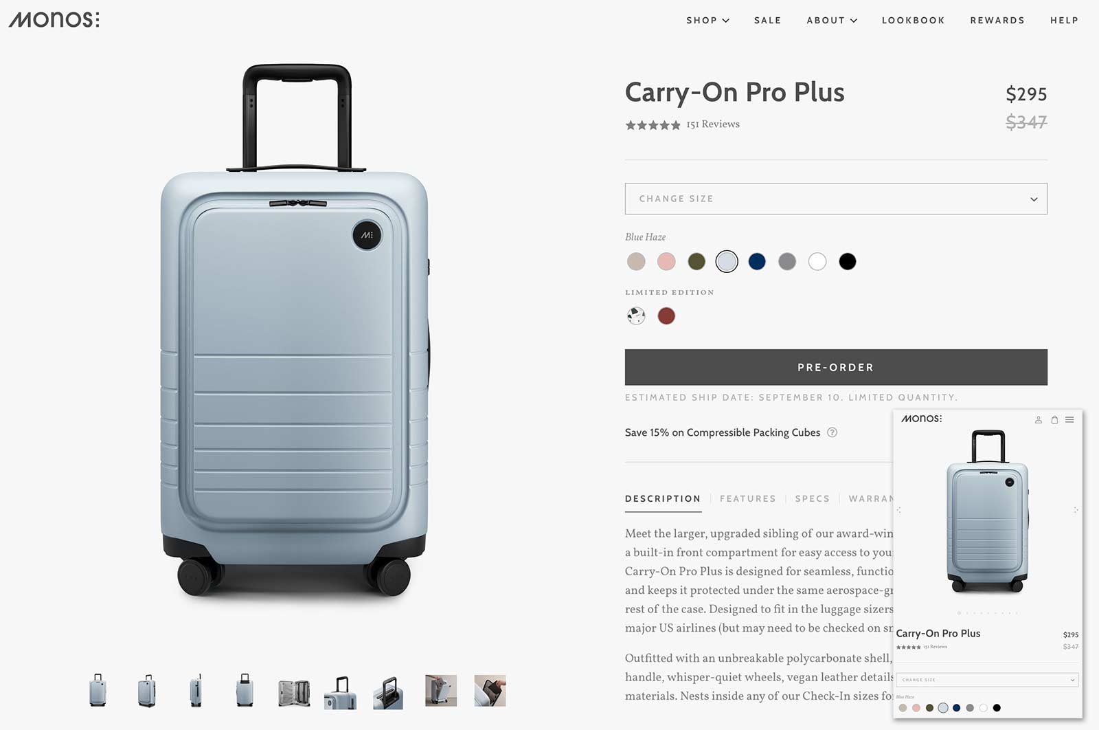

Gallery and context-of-use images. The image gallery showcases the product’s features from varying distances and perspectives. Simple “in use” photos show size and applications.
Sizing guide. Coolibar places the link (“Size guide”) where it matters most: above the CTA.
Prominent subscription offering (“Subscribe & Save”) while defaulting to the most clicked “One Time Purchase” option.
Photos for color and style enable shoppers to see close-ups of each attribute, such as color.
Coolibar’s product pages are informative in a small amount of space, with convincing details (images, sizing guide) near the top.
- A cross-sell link prompts shoppers to save 15% on accessories.
- An upsell function that makes purchasing a set of luggage a breeze. Tapping a + sign will display the bundled price and trigger the CTA to add two or more products.
Coolibar
Monos’s product pages are minimalist in design with social proof and product presentation that drive sales.
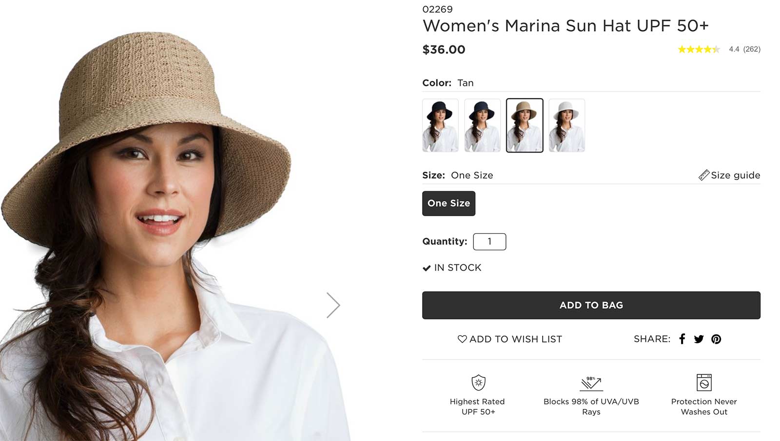

Coolibar sells sun protective clothing and accessories. Its product pages are immensely informative in a small amount of space, with the most convincing details sitting near the top.
Monos produces quality luggage. Competing with luxury lines, Monos’ mid-range travel gear has gained a substantial audience. The company’s social proof and product presentation drive conversions and repeat sales.
Intuitive cross-selling and upselling. Two elements increase average order values:
When it comes to compelling product pages, less can be more. Cluttered pages distract from selling points. Focus on the crucial details. Embrace a minimalist approach to lessen the thinking process and close the sale.
Kettle & Fire
What follows are 11 product page features from three online stores. Each presents unique ways to package products to sell.
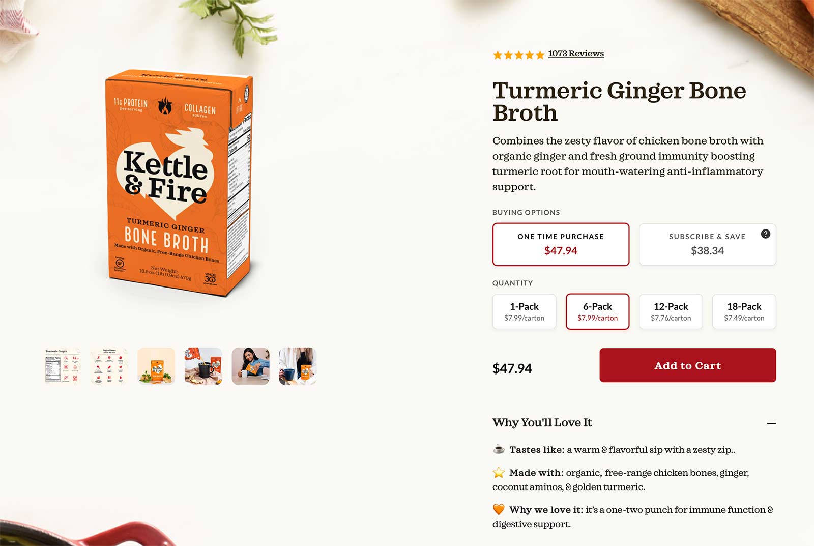

Suggestive quantity. Highlighting middle-tier pricing packages often closes more sales at that level. By pre-selecting the “6-Pack” quantity, Kettle & Fire likely has higher order values.
Quick, enticing bullet points. Instead of merely listing features, Kettle & Fire explains “Why You’ll Love It” with accompanying, fun emojis.
Importantly, Monos’s product pages exhibit essential components in a minimalist design, as follows.
Research First
Features icons. Each product page sports informative icons, such as the UPF rating.

