Millions of ecommerce sites look eerily similar. Merchants should consider their audience’s desires and behaviors to differentiate from competitors. Heat and tracking maps can provide valuable insight into where visitors leave. Detailed analytics tell us exact stopping points in the conversion process.
Let’s look at three online stores that are breaking the product-page rules.
3 Product-page Rule Breakers
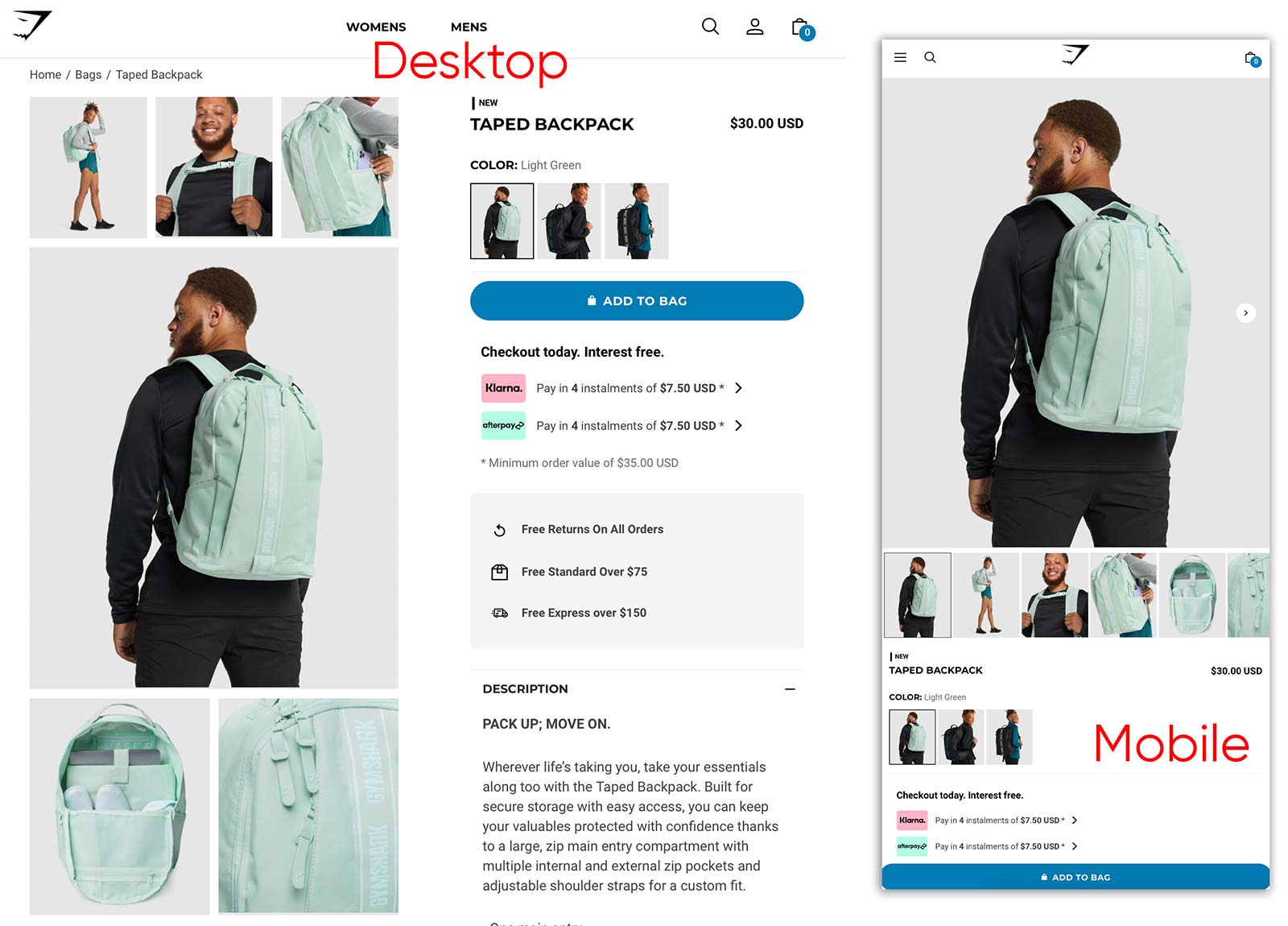
Gymshark, which sells fitness apparel and accessories, focuses on product images. On a desktop, grids of photos (and sometimes videos) take up the entire left side. On mobile, thumbnails are large enough to see core details. With a fixed CTA on mobile, shoppers only need to look at the bottom of the screen to add the product to the cart.

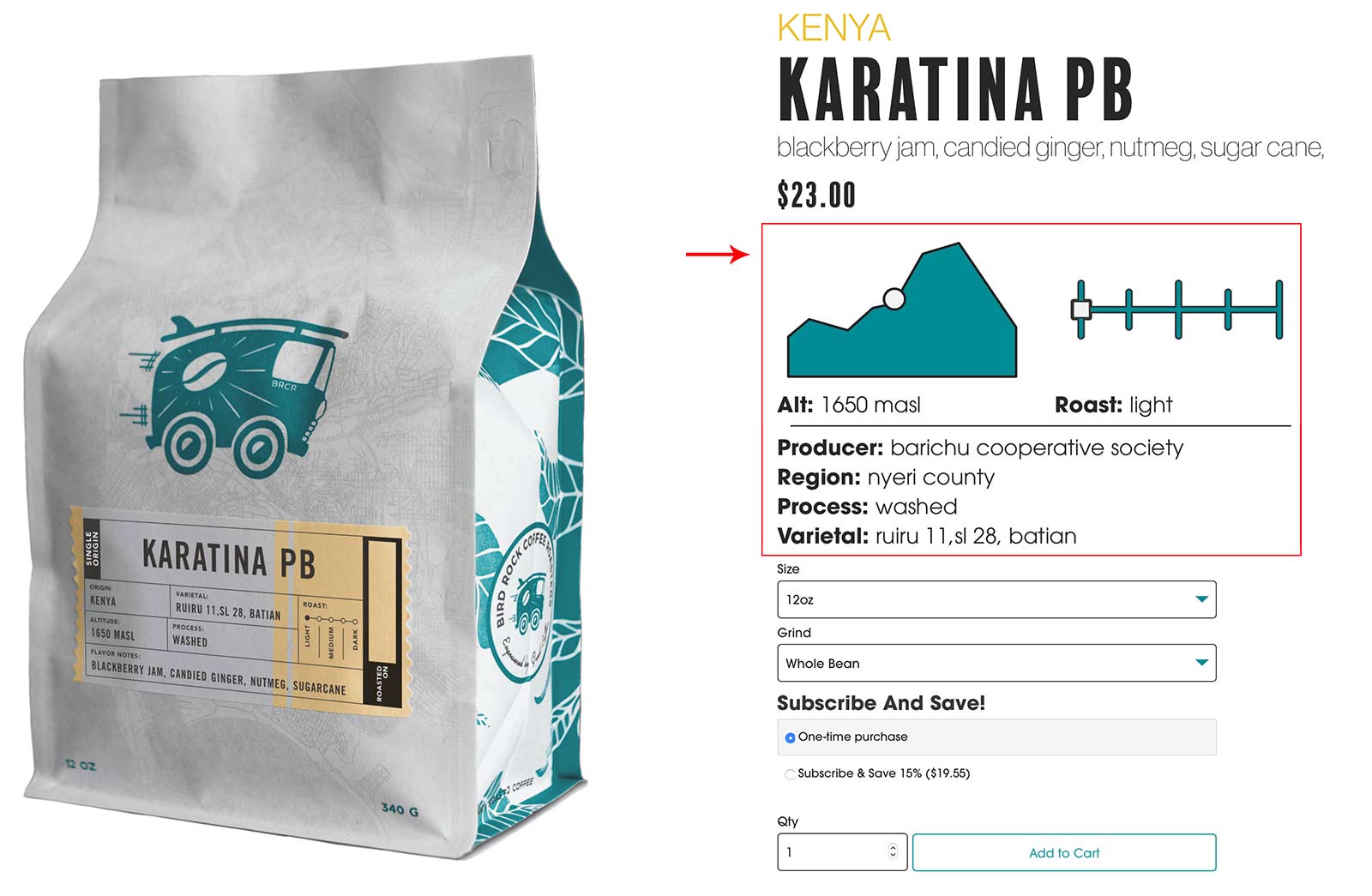
The image above is on a desktop. In a conventional mobile view, shoppers have to scroll two or more screens to reach the CTA. But not for Bird Rock. Even on mobile, Bird Rock places the most sought-after details above the CTA, lowering the likelihood of shoppers looking elsewhere for answers.
When wireframing new product page layouts, consider:
Don’t be afraid to experiment with product page variations. Start by inviting loyal customers to critique proposed layouts. Then follow up with live A/B testing. Take copious notes and annotate your analytics tool.
Don’t be afraid to experiment with product page variations. Start by inviting loyal customers to critique proposed layouts. Then follow up with live A/B testing. Take copious notes and annotate your analytics tool.
—
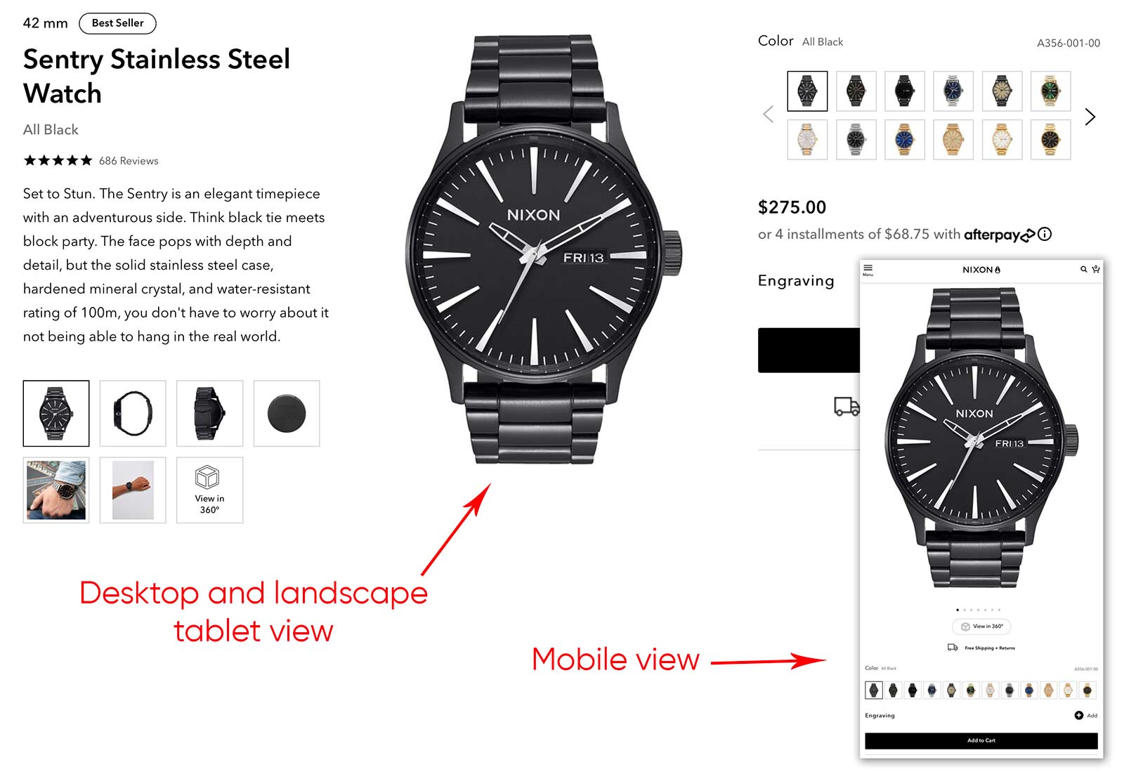
The desktop view facilitates reading left to right, showcasing key reasons to buy. Both views provide thumbnail images of each variant to speed up choosing a color and material configuration.
Bird Rock Coffee Roasters knows what’s important to customers. So it provides crucial details above the CTA — for desktop and mobile — including the bean’s growth altitude (which correlates to acidity) and the roast level. This helps shoppers make instant buying decisions. Bird Rock realizes that picky coffee drinkers often value specifics over price.

What Drives Shoppers?
Nixon, a lifestyle accessory brand, delivers different experiences on mobile and desktop. On desktops, it places product imagery in the center of the page, between the description and CTA. But on mobile, the main image displays first, followed by product options, add to cart, and description.
Reassembling product pages requires a balance of design, functionality, and consumer expectations. And product type plays a big role. A lifestyle company has different challenges than one selling power tools.
A three-column product-page desktop layout lets Nixon.com spotlights the main product images.
- Essential vs. secondary product images. Emphasize the most compelling images, such as alternate views and context-of-use.
- Data that drives the purchase decision. Anything presented above the CTA should guide the shopper to buy or not. For carry-on luggage, it’s wheel quality, unique features, and dimensions. For coffee, it’s the acidity and roast level. But not all products need information near the top, so evaluate case-by-case.
- Time- and action-saving features. The best layouts present the necessary info in the least amount of space, with plenty of breathing room. Keep in mind that popups and popovers require clicks and taps.
- How your audience decides. Some folks purchase wallets based on functionality; others value price. You can present the right information by understanding the reason shoppers purchase specific items.
Placing details above the CTA makes sense when it drives the purchase. Source: Bird Rock Coffee Roasters.

