Should you go long or short?
Hyperlinks and URLs are often overlooked when testing website elements, yet they can have a huge impact on conversions. If you’re creating blog content with links leading back to products and lead magnets, you’ll probably use a mixture of images and text based links to redirect prospects to relevant pages.
If you’re looking to put your A/B testing software into action, then you have to start with A/B testing the following 7 points in your website to optimize your sales funnels.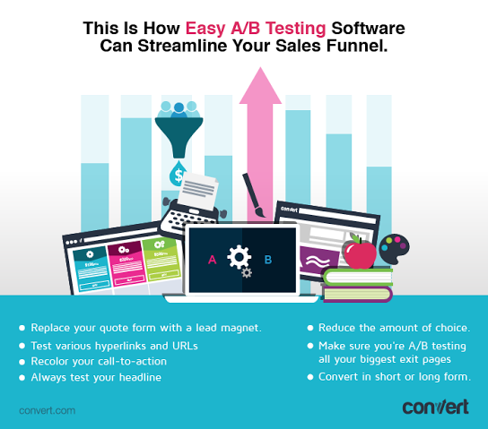
Some marketers argue that a call-to-action is the most important aspect of a landing page. Whether they are right or wrong, A/B testing your call-to-action is simple, easy and can result in a huge uplift in conversions.
1. Replace your quote form with a lead magnet
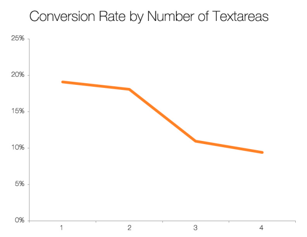
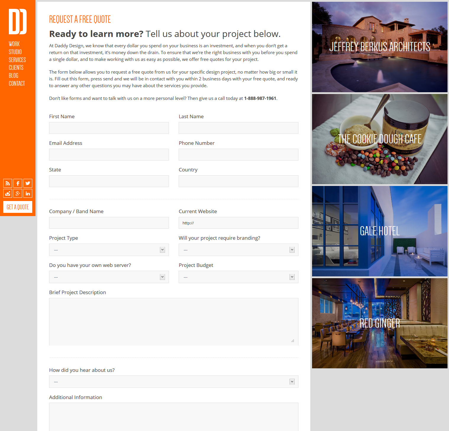
You’ll be lucky to get prospects to fill in more than 3 fields of a form nowadays, and giving free quotes usually goes above and beyond that. HubSpot revealed that the more text fields a form has, the less likely a prospect is to fill it:
I found that multiple textareas have a powerful depressing effect on conversion rates. -Dan Zarella, Social Media Scientist at HubSpot
[Tweet “Start #ABtesting the following 7 elements in your website to optimize your sales funnel.”]
Here’s a form from Daddy Design that I came across the other day with 15 fields that would depress anyone:
While marketers argue the importance of call-to-actions, I believe the headline is the most important attribute of any sales page. The headline dictates whether the prospect will continue reading or bounce, with only 20% of people choosing to continue reading.
If prospects have never interacted with your business before, they will have little faith in your business and almost no incentive to spend 10 minutes filling out your quote form.
Consider A/B testing your quote form page by using a lead magnet instead. Once you captured their email and provided them value through your lead magnet, they will be more likely to fill in your quote form after you’ve built some type of rapport.
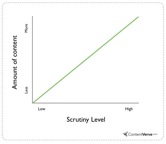
On the other hand, if Apple developed an unbreakable mobile device, they could probably get away with a much shorter copy as we hold the Apple brand with greater sentiment and place less scrutiny on its products.
Are prospects going to spend 10- 15 minutes filling in a form to hear back from a business they’ve never interacted with? Probably not.
There’s a lot you can learn about your business and customers from A/B testing, the more time you put into it the more you will get out of it.
A/B testing copy is one of the simpler experiments you can run that can dramatically uplift conversions. Neil Patel stated that he received 7.6% more conversions from longer copies along with gaining stronger leads in the process.
With the amount of A/B testing software out there, testing websites has never been easier. I’ve mentioned a lot of examples where simple changes increased conversions by as much as 600% running simple A/B testing experiments. These are extremely rare cases and don’t come along often unless you have a sound testing hypothesis.
2. Test various hyperlinks and URLs
I don’t want to break a sweat testing either. Call me lazy (and I’ll agree with you) but I want to make the simplest changes possible that provide me the greatest uplift in conversions.
If you’re a business that offers prospects free quotes online, maybe it’s time for you to stop.
[Tweet “Change your #CTA color so it’d represent the message of your headline and uplift #conversions”]
Find out the top 3-5 top pages that have the highest exit or bounce rates, run our Convert Optimization Stack and from the hypothesis use A/B testing software to find possible solutions. You may find a number of your web pages are leaking out a lot of targeted traffic and significantly impacting your lead generation and sales numbers.
Had they chosen pink, yellow, blue or black, I’m almost certain it wouldn’t have had any noticeable impact.
The problem is, people think “more is better,” but in the real world, long product lists are conversion killers. And if you want to increase your sales by 1,000%, you must streamline your offerings. – Derek Halpern, Social Triggers.
Too many options can often lead to confusion and prospects don’t like being confused. While you may think that offering more choice provides more value, Sheena Lyengar, a professor at Columbia University saw a 600% increase in sales of her jam when she reduced the amount of choices prospects had.
3. Recolor your call-to-action
A simple A/B call-to-action test on HubSpot revealed that by simply changing the color of a button from green to red increased lead generation by 21%:
I don’t believe in hard work anymore. In 2015, there’s so much technology out there that I shouldn’t have to break a sweat doing anything. I mean things have become so advanced that I use software to email my customers automatically!
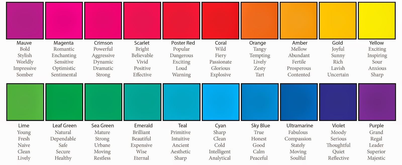
Here’s a color chart to help you align your message with the right call-to-action color:
I recently used a link cloak to A/B test my hyperlinks and saw my sales almost double in the first month:
The first URL doesn’t even fit on the page and looks very unprofessional. A/B testing hyperlinks and URLs can be done without using A/B testing software and the results can be huge.
Consider A/B testing the length of the headline, altering the message (trying motivation instead of fear for example) and placing keywords that are known to increase conversions such as free or you.
[Tweet “+Options means +Time. Decision making needs to be streamlined & lateral. #ABtesting”]
4. Always test your headline
For example, I’d rather focus on testing different headlines for a sales page that could have a huge impact on conversions, than rewarding the meta description for a blog post that sits on the second page of Google for its related keyword.

5. Reduce the amount of choice
The Performable ad above was using urgency and fear (read the headline) as the core message for getting prospects to make the desired action. The color red has psychological properties that promote fear and a sense of urgency matching their message and was probably why it uplifted conversions so much.
Decision making needs to be streamlined and lateral as possible, the more options there are, the longer it takes to make a decision. Considering reducing the amount of:
Content Verve believes that the more scrutiny a product or service is under, the more content is needed to convince prospects. For example, if a business you’ve never heard of was selling an unbreakable mobile phone, you’d probably put them under a lot of scrutiny and will require more information/proof before you make your decision.
Source: Which Types of Form Fields Lower Landing Page Conversions? via Hubspot
With recent studies claiming that humans now have shorter attention spans than goldfish, you’d be forgiven for thinking that short form copy converts better.
I didn’t have to fill that much information in when I bought my house!
- Options on your menu bars
- Social media sharing icons for blog posts
- Social media follow buttons
- Pricing plans (if you have more than 3)
- Click points on each web page
- Widgets on your sidebar
Too many social share buttons?
6. Make sure you’re A/B testing all your biggest exit pages
Too many drop down choices from your header menu?
It’s important to test the weakest points of your website as they’ll often be the areas where you’re losing the most amount of business. Login to Google Analytics and find the top 5 pages where traffic exit on mobile and desktop devices, then run our Convert Stack to come up with simple A/B testing experiments.
7. What converts better – short or long form?
Source: Madalinabalaban
Who said testing was difficult? 😀
If you feel prospects place your product under a lot of scrutiny, add more words. If you think the opposite, make it shorter and run some experiments.
But to play devil’s advocate, ConversionXL revealed 4 cases where conversions increased as a result of short form content.
Are you offering too many pricing plans?
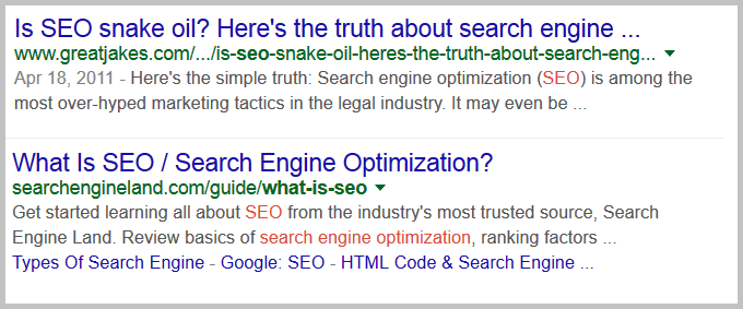
Also considering A/B testing the URLs of your key pages to see if they have an impact on clicks. Longer URLs look unattractive and deter people from clicking. For example, if you were looking for an article on SEO which of the following links looks more inviting?
Pro-tip: If you feel a lead magnet is not necessary to your audience, consider condensing your quote form so it takes prospects less than 30 seconds to fill in.
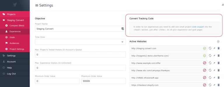
If you’re interested in start A/B testing right now, give Convert Experiments a try and register for a free trial for 15-days.
Conclusion
Here’s how you should decide the length of your content:

