Warranties. What happens if something goes wrong? That’s a pressing question on higher-cost items, such as fitness equipment and electronics.
U.S.-based drinkware manufacturer Tervis stands by its thermal tumblers with a lifetime warranty. If it cracks, swells, or otherwise doesn’t perform under normal use, the company will replace it. Figuring out what may be covered can be tricky, so the website presents illustrative examples.
Get personal with shoppers by introducing the staff. Source: Little Seed Farm.
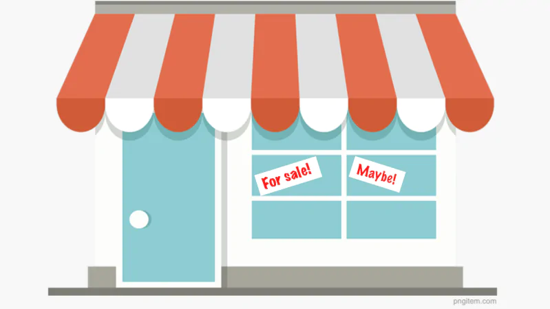
5 Common Policy Pages
Returns and exchanges. Forget lengthy instructions. Today’s shoppers want simplicity. The best returns process is self-managed, meaning the shopper can look up the order and click a button to generate an RMA and shipping label. An easy returns process is one of Amazon’s prized features. Customers can opt to have the package picked up by a carrier or drop it off at a returns counter in their area.


Shoppers search an online store’s policy pages for details on shipping, returns, and more. Rarely are these vital pages engaging. But they should be.
- How quickly orders are processed, packed, and shipped.
- The packing materials used (for environmentally-conscious companies).
- The carrier(s) and method(s) used.
- How to track shipments.
The shipping page should also include:
Ditch the jargon. Use bulleted lists, illustrations, and photos to show shoppers exactly what’s covered.
Illustration of damaged Tervis drinkware
Ikea’s easy-to-understand returns and exchanges page.


Shipping information. Ideally, shipping costs and transit times should appear before the checkout process. However, shipping information pages provide preliminary details, along with information the shopping cart might not display. A map that points out expected days to delivery helps shoppers plan. The example below is from Adagio Teas.
When amping up the about page, consider including the following components:


Privacy. Most people don’t read privacy policies, yet they’re essential to any website. The privacy policy explains how your company collects and manages visitors’ data. Google is known for collecting a wealth of data across its own and partner sites. Its privacy policy page is lengthy but easy to digest in logical chunks. Using explainer images and videos is an excellent way to educate visitors and help them feel comfortable sharing information.
Don’t confuse consumers upfront. Be clear about what can and cannot be returned and when.
The about page should make customers feel welcome and good about supporting the company. If you focus, say, on quality, value, or sustainability, talk about it. Use section headings or bullet points to call attention to each segment.
Ikea focuses on the customer experience from start to finish. Whether shopping in one of its 430-plus physical locations or online, loyal consumers (primarily millennials) are hooked from the moment they walk in or log on. The Swedish company focuses on value, and that includes a 365-day return policy.


Adagio provides transit times with a color-coded map.
- The company’s mission statement.
- How the company started and why it exists.
- Video walkthrough of the facilities.
- Video walkthrough of how something is made, packed, and shipped.
- Photos of essential staff, especially those in lower tiers.
- Highlights of important causes the company supports.
- How the company keeps customers safe.
Ikea’s online customer service section is simple. The returns and claims page relies on visuals and elementary text to guide shoppers to returns, replacement parts, and warranties. When clicking through to the “no-nonsense returns policy,” you’re faced with four paragraphs of easy-to-read text.
About us. Plenty of businesses misunderstand the purpose of the “about” page. This is the place to tell shoppers why the store exists, the company’s values, and how it operates. Personalizing the experience is key, so be sure to include photos and details about the brand, including the people behind the scenes.