- Effectively representing who you are, what you offer, and what benefits your products or services bring
- Standing out from the competition by offering products or services with differentiating qualities—which may include lower pricing, higher quality materials, better reviews, awards and certifications, and more—and making these differentiators known
Shoppable Tile we created for the In-Home Guardians Category Page
Table of Contents
Customized Creative Briefing
If shoppers want more information before adding to cart, they can hover over each product and click the new ‘Quick Look’ feature for additional details, or click the product name itself to be taken to the full PDP.
- Learning more about the client’s full product lineup, including which products are most popular and/or important
- Exploring who their target demos are, which has a heavy influence on all elements of copy and design
- Discussing which particular elements of their product or service should be highlighted within their creative
Next, our team leveraged a relatively new autoplay video tile that is often overlooked or underutilized by brands in Amazon Stores. We created the video using existing assets, thoughtfully selecting which overlays, graphics, content and cuts to use while adhering to Medical Guardian’s latest brand style guidelines, and Amazon’s own guidelines. This presented an eye-catching, easy-to-understand way to showcase:
The homepage should be tailored for the audience that comes in organically, giving your brand story and top products premier placement.
- Medical Guardian is a leading provider of medical alert solutions that help their customers live a life without limits through use of their medical alert systems and service. Emergency assistance is provided through one of two ways: when a user presses their medical alert button, or through Medical Guardian’s optional fall detection technology
- They have the most innovative product line, offering protection for their customers both at home, and on-the-go
- Medical Guardian has award-winning customer service in the healthcare industry
- Medical Guardian offers one of the most discreet and lightweight devices on the market with the Mini Guardian
- Medical Guardian has consistently earned a #1 ranking on third-party review sites, helping build their credibility as the top provider in the industry
- All of their medical alert systems feature 24/7, 5 Diamond UL Certified, 100% US-based monitoring, with redundant backup monitoring centers
- They recently launched their new MyGuardian Customer Portal, built to improve self service, product education, and deliver real-time information on device analytics
For this section, our Creative team highlighted how Medical Guardian stacks up for three of the most decisive brand considerations to make when comparison shopping for medical alert devices.
Orders: +41.6% increase
Amazon Store Design
Ready to learn more? Contact us today to chat with an expert!
Consider the Traffic Source
To make navigating to the full selection of in-home and on-the-go devices as easy as possible, Tinuiti created dedicated category pages for each, and included links to both within the top navigation.
Conversion Rate: +4.7% increase
While the option for brands to use basic A+ content is free unto itself—with premium A+ content offering even greater features at a cost—the more time you invest into the strategic creation of that content, the better results you’re likely to realize.
For some of these successful businesses, the brands themselves played an active role in creating that want or need. For others, it was always there in some capacity—food, clothing, shelter, etc. Whichever camp your brand falls in, lasting success will depend on a number of factors, including:
Once our team worked with the client to understand what the creative needed to cover, they got to work on their specialty—the how of best conveying all those key elements in a way that is most beneficial for the brand, and most likely to drive performance on Amazon.
When used effectively, A+ content can play a pivotal role in increased sales and reduced returns, as shoppers are given the necessary information to make an informed purchase. However, despite its name, not all A+ content has truly earned the grade.
For this project, the overarching question the creative assets and design needed to answer for was: Who is Medical Guardian, and what makes them special?
Amazon Store Header Image
Here are some ways our team did that for Medical Guardian, reviewing the homepage design—one of four pages we designed for this project—from top to bottom:
- Medical Guardian’s name and logo
- The same color scheme as the brand’s primary website
- A tagline that conveys the brand’s purpose and value
Amazon Store Top Navigation Selection
Next, shoppers are presented with Medical Guardian’s flagship products. Items that are in stock feature a convenient ‘Add to Cart’ button so customers can make their purchase quickly and easily.
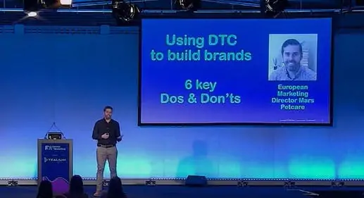
Tinuiti’s Amazon Creative team recently had an opportunity to help Medical Guardian enhance some of those elements of lasting success with a new custom Amazon store design, and strategic use of fresh A+ content pages. Let’s explore the process for each, and take a look at the early results.
Video Background Tile
Conversion Rate: +0.20 Points
“Consistent design is important. We aren’t just building pages; we’re building a brand, and a shopping experience for that brand on Amazon, that is tailored to that channel.”
- A short lifestyle video of a woman gardening while wearing her device, visually showcasing the freedom the product offers, while also showing what it looks like when worn. Pro tip: Even when providing comprehensive product dimensions, showing a wearable product “on” is recommended so customers know exactly what to expect
- “Living life the way I want to” message is fully conveyed through on-screen text with no disruptive audio
- Medical Guardian’s Consumer’s Choice Award, which provides potential customers with certainty of quality and reliability (social proof)
Product Grid Tile
Sales: +30.34%
Visitors often navigate to Amazon store homepages by clicking on the brand link within an Amazon PDP. These visitors include potential customers who landed on a PDP through a variety of potential avenues—including ads or an organic search result on an Amazon SERP—but may not be quite ready to purchase just yet.
Secondary Navigation: Clickable Tiles for In-Home and On-the-Go Guardians
This bottom-of-homepage video provides information about how the alert system itself works so shoppers know what to expect in the event they ever experience an emergency and need to activate their unit.
As mentioned above, our team learned in the research phase that all of Medical Guardian’s emergency response devices fall within one of two categories: those designed for on-the-go wear, and those designed to be worn in the home. This informed the primary navigation, and carries through to the tile-based secondary navigation.
Your store will include a primary, top navigation, but it’s important to think of all the links and tiles within your homepage as a secondary navigation that helps funnel shoppers to the products and information they’re most interested in.
Our Amazon Creative team knows how to best utilize modules, image types, and textual elements to provide shoppers with the information and confidence they need to make an educated decision. They flexed their creative muscles to do just that for Medical Guardian, as highlighted in the examples below.
— Hiram Cruz, Creative Director at Tinuiti
Shoppers also have the option to click to specific PDPs for some of Medical Guardian’s most popular products.
- To make it as easy as possible for customers to determine which products best met their needs, our team listed all on-the-go devices on the left, and all in-home devices on the right, directly beneath the tiles that lead to their respective category pages
- Each product-specific tile bears a similar image and text layout for a polished, professional, easy-to-understand experience:
- Our team included an “On-the-Go” or “In-Home” flag on each product-specific tile for additional clarity
- The name of each product is featured in clean, large font that is easy for shoppers of all ages to read
- Each product-specific tile includes 3 bullets that highlight some of the most important ‘top takeaways’ about the product to help shoppers choose which to click for more information
- The final tile in the bottom right corner serves as a reminder of why Medical Guardian’s products make such an important investment for seniors
Important Brand Considerations
To optimize for the best user experience, you must first consider where a majority of the traffic to your Amazon store pages will be coming from, including the homepage. Unlike the traffic to your own website’s homepage, typically, a high volume of the traffic to your Amazon Store’s homepage comes from users already shopping on Amazon.com.
Part of A+ Content we created for the Home Guardian PDP
Informative Video Tile and About Section
Sales: +147.24%
Sales: +152% increase
A+ Content Worthy of the Grade
Image Source: Medical Guardian Amazon Store “Our team takes pride in our thorough knowledge of the Amazon guidelines, and stays up-to-date on the newest modules, tiles, trends, Amazon releases, restrictions, and more. We combine our extensive Amazon knowledge—having worked in this space since Amazon stores were merely a single Brand Page, and A+ Content was one large ‘Enhanced branded image’— with our knowledge of the brand to strategically design the best Amazon creative for them.”
In the research phase, our team learned that while there are a variety of different features from device-to-device, all belong within one of two primary categories: those designed for on-the-go use, and those designed for use within the home.
Image Source
Before our team dives into an Amazon Creative project, they work closely with the client to learn more about their business objectives and goals, and who they are as a brand. Other areas we focus on in the research phase include:
Medical Guardian Creative Examples: Store Elements, A+ Content & Detailed Page Images (DPI)
Conversion Rate: +0.44 Points
Conversion Rate: +0.44 Points
This Video Background Tile on the In-Home Guardians Category Page automatically ‘plays’ through the Classic Guardian’s features, marked A – E, with the text at the bottom changing to illustrate what that particular part of the device is as it rotates through each letter. This can be especially beneficial for users who have difficulty reading smaller print, and would prefer a visual overview to reading a manual.
Amazon Creative Refresh Results
Amazon Store Performance Results
In short, when Medical Guardian came to us, they had already tackled many of those elements of lasting success we highlighted earlier, from stellar reviews to best-in-class features. They had all the right ingredients, but needed that Amazon-specific recipe for the best presentation.
Directly below the video, the brand and its mission statement is reinforced to ‘wrap up’ the homepage. This section serves as a footer on every page of the store for consistency, and to reinforce the ‘Medical Guardian experience’ within Amazon.
At the top of the homepage, shoppers are presented with a clean, clear header image that features:
A+ content enhancements to the popular on-the-go Mini Guardian PDP resulted in:
Mini Guardian – Product Page with A+ Content & DPI
— Francis Bonilla, Senior Manager, Creative Services at Tinuiti
The answers to those questions includes, but is not limited to:
Part of A+ Content we created for the Home Guardian PDP
Home Guardian – Product Page with A+ Content & DPI
Large Image Tile we created for the On-the-Go Guardians page
Now that we’ve explored how we help clients stand out from their competitors, we want to highlight some of our own strengths and differentiating factors:
Image: Tinuiti Creative Workflow
Why You Should Partner with Tinuiti for Amazon Creative Services
As the front door to your personal store-within-a-store, it’s important that your Amazon store homepage is designed with Amazon’s ecosystem in mind, while also telling a consistent brand story. This same necessity carries over to your category pages and PDPs (product detail pages), with each requiring its own set of creative considerations. Some ways our Marketplaces Creative team accomplished this for Medical Guardian include…
Detailed Page Images (DPIs) we created for The Mini Guardian
- We understand the value and importance of the research phase. Rather than rush to design, we take the necessary time to learn about your business, your target audience, your brand standards and values, preferred tone of voice, and more
- We offer previews throughout the design process so we can consider your feedback at every stage, while providing you with the necessary information to keep your team updated about the status of the project
- Our team doesn’t simply design and handoff the files; we see the project through from start to completion, including implementation, review, and Amazon approval. We’ll work through any edits Amazon may request in their review process, and ensure that when we officially ‘walk away,’ your new store, and/or refreshed A+ content, is in place, and satisfies Amazon’s requirements
- We have the necessary experience. Amazon has a lot of rules and requirements, and through years of working with Amazon sellers, our team has learned them all. From strict image size and video tile length requirements, to rules regarding outbound links, our team knows the ins and outs of Amazon, which results in better design from the outset with fewer necessary edits, and a timely turnaround
- Our advanced experience with Amazon enables us to strategically use some of the newly available tiles that other brands in your space may not be leveraging. When new Amazon store tiles become available, our team makes it a top priority to learn as much about them as possible, and think of ways to most effectively use them to our clients’ benefit
A+ content enhancements to the popular in-home Home Guardian PDP resulted in:
If their apprehension comes from wanting to learn more about your brand and/or full product lineup first, they will often click the link within one of your PDPs—as shown in the example above—to be taken to your store.