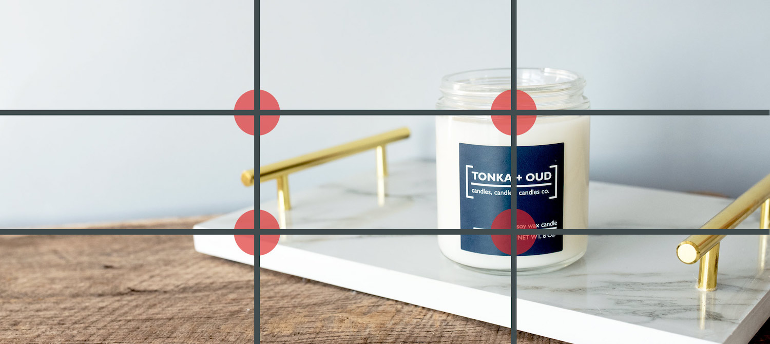
This type of offset image is useful because it creates a natural focal point that draws in viewers. Having the subject in one-third of the composition with the remaining two-thirds balanced with negative space is attractive, and more importantly, feels right to a viewer.
The rule of thirds is critical when shooting products. It’s easy to implement and can greatly impact how a shopper views a product.
The rule of odds calls for grouping multiple items in a photo in odd numbers, such as three or five. This example from Ivory.com uses groups of three.
Rule of Thirds

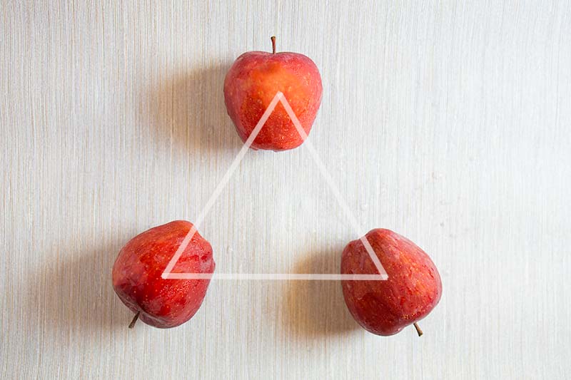
Try to break up a boring, horizontal line of products by forming a triangle or a vertical arrangement. (I’ll address diagonal composition in a later installment.)
Photo composition refers to the arrangement of an image’s items and elements. For product photography, composition has one goal: create an image that draws a shopper closer to purchase.
In photo composition, the rule of thirds dictates setting the primary subject slightly off-center. A camera grid can help. Image: CandleScience.com.
Finally, use a camera’s lens focus to your advantage. Not every subject in an image needs to be completely clear, as demonstrated by the Ivory.com deodorant example. Find an aesthetically pleasing layout and experiment with the best focal point. Try new arrangements and settings. Create images that will engage your shoppers and drive sales.
Rule of Odds


Instead, apply the rule of thirds, which is to offset from the center slightly. The rule states that the subject of an image should be placed at the intersection of predetermined vertical and horizontal lines. An iPhone camera, for example, has a grid setting to help, at Settings > Camera > Grid. Nearly all DSLR cameras have a similar tool.
Procter & Gamble’s Ivory.com uses the concept. The body wash and deodorant shots on the home page, above, contain three items. But each product within the image is unique, with slight discrepancies in color and clarity, prompting the viewer to pause. The result entices shoppers to click. It’s terrific, powerful photo composition.
Three or five products are generally the best for product photography groupings. Differentiate the items by stacking some of them on a different plane, pairing a larger object with a smaller one, or varying the distance or angle.
Setting items in a triangle, such as these three apples, is better than a simple horizontal line. Source: PhotoAxis.com.


This is the eighth installment in my series to help ecommerce merchants improve their product photography. “Part 1” addressed the importance of backdrops. “Part 2” explained tripods. “Part 3” examined the fundamentals of artificial lighting. “Part 4” reviewed angles and viewpoints, “Part 5” dealt with choosing a camera. “Part 6” assessed lenses and their importance, and “Part 7” focused on magnification and close-ups.
The rule of odds is another simple yet effective composition tactic for product photography. The rule states that when shooting more than one object, always group in odd numbers. Odd-numbered groupings force the human eye to work harder to view each item.

This image from Apple features five iPhones at different angles, distances, and colors.

