These questions happen instantaneously. You’ve likely visited websites that aren’t clear about question one and then closed that tab and moved on. Once our brain confirms valuable information, we make a micro-decision of whether to move to the next step.
For ecommerce sites, that funnel is often two, three, or even four navigation bars, depending on the amount of content. Each facilitates decisions.
Consumers in 2022 face an avalanche of data. We’re all forced to make countless daily decisions, however minor.
Micro-decisions
Thus an easy-to-navigate ecommerce site, one that simplifies decision-making, is the first step to conversions. Visitors need to access information without getting overwhelmed. They need to determine instantly whether to continue down the funnel.
- What is this?
- Who is this for?
- What do I get?
When setting up navigation menus, it’s essential to understand how shoppers make micro-decisions, which are typically a variation of three subconscious questions:
Navigation needs to be straightforward to those who see value in your site. If a visitor decides to proceed, the navigation must wisely guide her to the ultimate destination: a purchase of your products.
Navigation Options
But, importantly, don’t add every search option to that top navigation. It will overwhelm and exhaust visitors’ brains. A better option is three or four navigation bars throughout the website. Multiple navigation bars, each with a unique purpose, allow visitors to make micro-decisions.
In short, website navigation should mimic the behavior of our brains. We seek easily understood info. We avoid difficult decisions. Guiding shoppers down that path — from simple to detailed — leads to more sales.
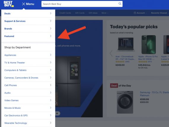
Best Buy’s second menu, on the left, contains 17 product categories — “Shop by Department.”
Scrolling is a natural behavior. Social media platforms have taught us to scroll infinitely.
Hence many sites now opt for sticky menus that remain at the top as visitors scroll down, exposing them constantly to the main navigation.

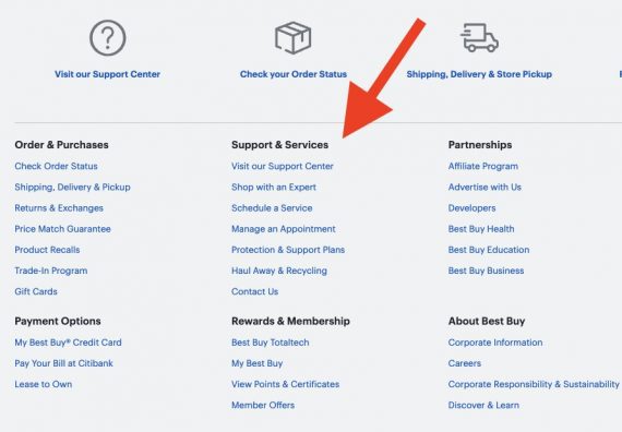
A third Best Buy menu, in the footer, is comprehensive — a compilation of all navigation links grouped in sections. Having reached the bottom, visitors have been exposed to additional info. Their brains are ready for more.

More Sales
Best Buy’s footer menu is comprehensive, with all content organized into sections.

![Gmail Ads Rolling into Discovery Ads [Everything You Need To Know]](https://research-institute.org/wp-content/uploads/2021/02/gmail-ads-rolling-into-discovery-ads-everything-you-need-to-know-768x376.jpg)


