Big fan of lifelong learning here 🙋🏻♀️ . But not a fan of the “learn more” CTA. Here are some better ways to send website visitors to other pages on your site.
I will say, however, that I’m not sure how I feel about the “next” button copy. It puts into question just how long this sign-up process is. While the next step is the final one (optional phone number entry), the user has no way of knowing that.
No, not the most visually appealing pop-up. And I wouldn’t advise using FREE in all caps twice—makes it feel almost less trustworthy. But I do like the surprising creativity of the “Submit” button.
The call to action button below is a great example of using psychology in marketing—in particular, the commitment and consistency bias, which says that we make decisions that are in line with who we’ve declared ourselves to be. If you love your pet (and who doesn’t), then not signing up for this newsletter is inconsistent with this self-perception. See what they did there?
Table of contents
And when you’re done here, don’t miss our 36 best call to action phrases (ever).
Free account call to action examples
But sign up in 30 seconds? Now that sounds fast and easy and definitely doable now.
Sign up in 30 seconds
A benefit sandwich with artisan, feature-rich bread.

- Start doing your taxes now ⬅️ Doesn’t make taxes any easier.
- Start watching grass grow now ⬅️ Doesn’t make grass-growing any faster.
Seeing how feels easier than learning more.
Not only is “explore” a more powerful word than “learn more,” but it also carries more appeal than “learn more.” This is a great word to use in your meta descriptions as well.
Newsletter signup CTAs are usually the most creative. After all, the stakes aren’t as high so there more room for experimentation.
This reminds me of the cognitive fluency effect in my psychology copywriting post.
Get started without a credit card
I mean, you wouldn’t want to be considered a bad pet parent…would you?
You’ll also notice that the copy surrounding this call to action also lends to the feeling of ease (“go straight into a demo account”) and speed (“Ready to give us a go?!”).
This same site has another creative CTA button. After telling you another set of benefits you stand to gain from its platform, you’re told to sign up and watch the magic unfold. Then the button is a question—”How do we do that?” You get the sense from this language that the implied question is “Whoah cool! How did you do that?”
A single screen should only need a peek anyway.
Lock in my free account
Then you’re reassured you won’t get bombarded by emails with “Don’t worry. We brush twice a day, but we email way less often” in parentheses. This is fun, creative copywriting that gives you the sense that a team is talking to you, not a business.
If the options were “No” or “Yes,” the “yes” would feel more serious and committal, but the “Sure!” gives the feeling that this is a low-risk opportunity to be seized.
“Give me the deets” makes you actually want to contact this company.
2 min demo

This site follows call to action best practices with its specific button copy, but what really stands out here is the interesting language. In addition to “See Creative Visions Come to Life,” the homepage also has buttons that read:


Learn more call to action examples
This is the CTA button on a careers page to go to the open job applications—way more warm and friendly than “apply” or “view openings.”
Give me the deets
I do not recommend using “submit” as a call to action since it’s unspecific and colorless and can scare users away. But “Let’s get sleepy” is on-brand for Luna and preserves the friendly nature of the pop-up.
Exhibit A:
Here’s another strong call to action. “Lock In My Free Account” sounds firm and dependable, but it also suggests that there’s the potential to lose the free account. When you read closely, you see that it’s a limited-time offer. Had this button read “Unlock My Free Account,” it wouldn’t have conveyed the finite nature of the offer.

See creative visions come to life
Another cute play on words.
- Get Top-Rated Customer Support
- Get Express 1-Click Updates
- Check Out the Visual Wonderland
- Get Pro-Level Visuals
Here’s another on-brand CTA in a pop-up for a toothbrush website. It reads “Get a Minty Fresh Deal” (for 20% off your first order if you sign up to hear from us).


Take a peek


When taken out of context, this CTA doesn’t feel trustworthy. But given the newsletter it comes from (and the specific instructions above that say “click the button below that says “Push For Fun” above it), this button works.
See how
Really Good Emails is known for its conversational and humorous tone, so it’s no surprise that the CTA for its Unspam event is “Get yo’ tickets while they’re hot.” (They’re using the wrong their there…)
“Sure” indicates a low-risk opportunity.
This site could have just used “Get started free” for its CTA button copy, with a little “No credit card required!” underneath and that would have conveyed the message. But there’s something about putting “Get started without a credit card” in the entire button that makes it feel more secure or true.
How do we do that?
“Let’s get sleepy” redeems the use of “Submit” in this pop-up.
5 min feels quicker than 5 minutes.
Create content your way
Okay, maybe not that far for every brand, but in general, our ability to test and measure has enabled us marketers to get more creative with our messaging. A while back, we shared some kick-ass call to action examples. Don’t get me wrong—they’re still good enough to deliver a delightful ambush to the rear—but it’s time for more.

No work needed on your part. Sit back and we’ll take you there.
Take me to the blog!


This is a cute lil’ call to action from an actual soda pop brand. I also like “drop your email” as it sounds easier and less serious than “enter your email.”
Explore
Not only is this more interesting language, but using these for button copy reinforces what’s being talked about in each section.
Try it feels less commital than “sign up.”

Newsletter sign up CTA
“Lock in” suggests this offer may not be around forever.
Be sharp

So here are 24 unique, smart, and memorable call to action examples to give you the creative kick you need.
This could potentially be because the color blue represents trust and dependability in color psychology, or maybe just because the text enclosed in a box feels more official. Either way, it’s a good call to action.
Let’s get sleepy
This call to action button is to purchase guided monthly wellness planners. Given words like “proactive,” “self-care,” “productivity,” and “true potential,” we get a feel for the type of audience this site is targeting—and given the target audience, the tone of this button copy is just right.


Get a minty fresh deal
Push for fun: not recommended without highly specific surrounding copy.

This first set comes from various SaaS websites that offer a free trial or demo. Let’s take a look at some more effective ways to make this offer.
The primary call to action on this homepage screenshot below is “Get started for free” but the pink play button in the platform screenshot next to it is what I like. It reads “2 min demo.” Even though there isn’t a verb in this CTA, it works in conveying speed. It just reads feels faster than “2 minute demo” or “watch the quick demo,” doesn’t it? Almost like they know not to waste that extra millisecond of my time by making me read an additional word.
Any phrase can be powerful with the right imagery.
Sure

On a related note, we do have a guide on how to write an awesome case study and some contact us page examples if you’re interested.
The CTA is half the invitation for an event.
In this example, we see the three most recent blog posts on a website’s homepage with a call to action to go to the blog. Instead of “Visit the blog” or “Go to the blog,” “Take me to the blog!” has more pep in its step. It also shifts the action away from the visitor. No work on your part.
Add a little pop to your inbox
Exploring is more appealing than learning.
Sendible…the Burger King of social media management.
Industry-appropriate puns…you can’t go wrong.
I want charts
In and out in 12 words.
The call to action here is for serious prospects to reach out to learn from more case studies that aren’t publicly available on the site. “Give me the deets on hush-hush projects” is way more fun, compelling, and approachable than “Some projects for major brands are confidential. Contact us to learn more.”
“I want to get healthier” puts the reader’s goal into full focus and also serves as a sound bite for all the copy above that you don’t want to read (one of our copywriting techniques).
I want to get healthier

As you can see, call to action buttons need not, and should not, be limited to “submit” or “contact us.” In fact, making them more specific and more creative can encourage your audience to take the action you’re calling them to.
This call to action is super simple. No exclamation points or fancy features. No commitment. Just try it.
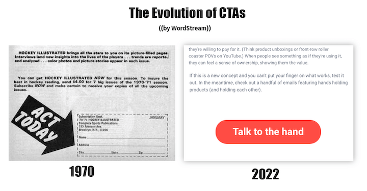
Calls to action have come a long way…
Try it
I came across this when I was specifically looking for creative and compelling ways to display data. I quite literally wanted charts, so this resonated perfectly with me, but the phrase above it is also worth noting as well. If you only read the bolded words in it (business, tech, entertainment, society, 5 minutes to read, free) plus the button, you have a clear picture of the value you’ll get out of subscribing—in just 12 words.
“Without a credit card” is the new “free.”
I’m the best pet parent
This is just a fun way of offering a tour of your platform—as long as the surrounding content is specific enough. Here’s another super-specific call to action to visit the product page. Instead of “learn more” it says “Create content your way,” a perfect summary of the features desribed right above it.
This is a unique way of wording your “yes” and “no” call to action buttons. The question is “Would you like a heads up about fresh iPhone photography articles?” and then you have “I’m ok” or “Sure!”

More call to action examples
Commit to yourself
Applying is a chore for outsiders. Joining is an invitation for welcome guests.

Inspirational CTAs…Hallmark’s got some competition.
Push for fun
How DO they do it?
Technically, the call to action for this popup is “Get them now!” with “them” being deals and discounts. But the call to action I like here is “be sharp.” I can’t say I like the image, but it catches your attention, right?
For each of the features and benefits on this website homepage, the call to action is to “See how.” This feels like less work than learning more—like they’re going to show you rather than you having to do something.
Get yo tickets while they’re hot

Surely you can afford to give just 30 of the 86,400 seconds in your day.
Perhaps take a page out of chartr’s [12-word] book?
Join us
Aside from a memorable call to action, you can find lots more ways to get more email signups here.


It’s the oldest tactic in the book to add “now” to your CTAs to give them more urgency. But urgency doesn’t equate to ease or speed.

