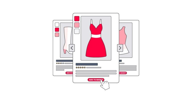
Nearly any product type can be presented in a simple format that eliminates guesswork and saves time.
Most online stores could benefit from mini-updates — typically one or a few at a time addressing key issues. Be sure to annotate the changes in your analytics dashboard for easy reference.
Advantages of Simple
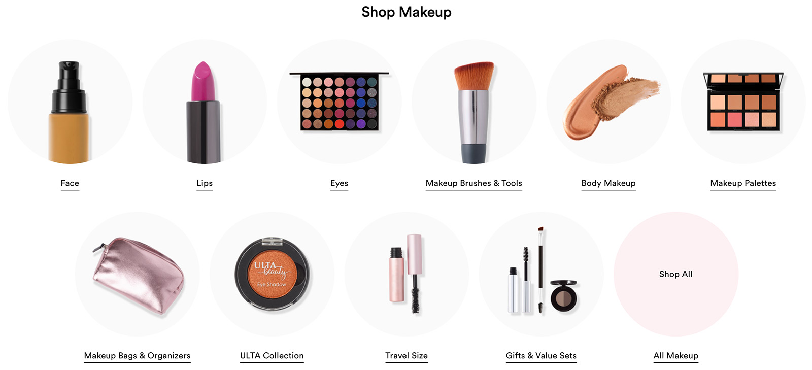
Ulta Beauty is a prominent brand. It’s been on the Fortune 500 list since 2018. Yet, its online store doesn’t have a slew of bells and whistles. Instead, it logically guides shoppers to what they need.
A “less is more” approach is budget-friendly and focuses on what matters most. At the top of the list are transparency, trust, personalization, and ease of use.

While slick features are nice, today’s shoppers care more about causes, quality, and experiences. They will support companies based on community participation, even if the products cost more. And they’re more apt to spend money with a business that makes the entire customer journey easy and enjoyable.
And the basics have mattered since the start of ecommerce. The reason is simple — they work.
Updates to ‘Less Is More’
Ulta displays product types in a simple, straightforward manner.
Consider the following small yet powerful improvements.
- Add attention-grabbing taglines to elite products. Short phrases can prompt shoppers to click the call to action.
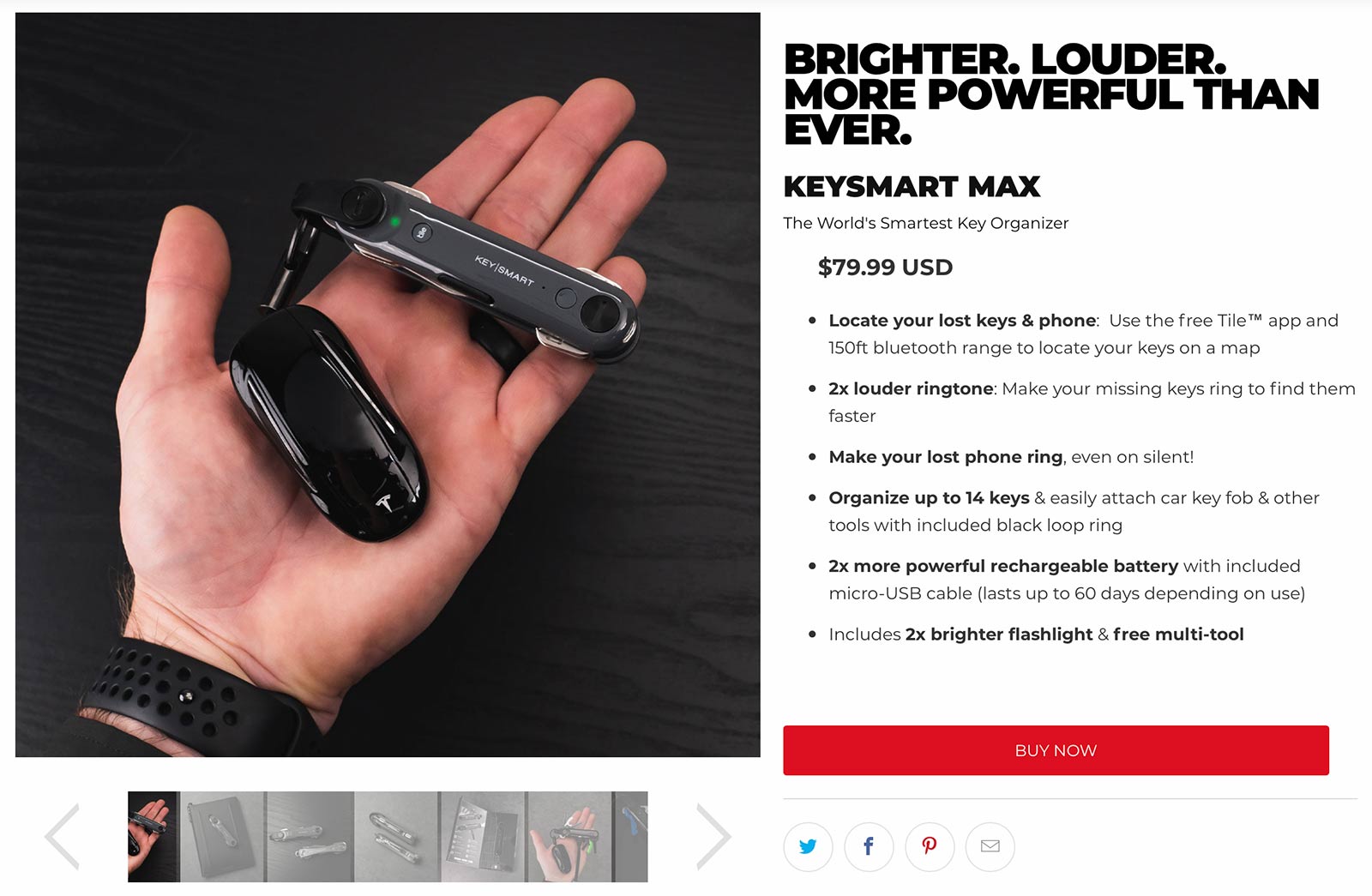
- Emphasize compelling phrases in bullet points. It’s easier to scan and understand prime features. Keysmart’s product page, for example, relies on bold headings, quick bullets, and clean imagery.

Call attention to the most compelling feature in each bullet point. Source: Keysmart.
When seeking ways to convert more shoppers into long-term customers, don’t overlook the basics.
- Showcase benefits, not products. Update messaging (even on the home and landing pages) to reflect what your products do for consumers. This helps shoppers understand the pain points being solved.
- Refresh the FAQs. Regularly updating a frequently-asked-questions page can instill trust. This one-stop page can also decrease customer service requests.
- Remove checkout friction. Minimize form fields and suggest add-ons without interrupting the process.
- Display trust badges. SSLs, product reviews, alliances, and awards build social proof. Test different placements.
- Embed user-generated content. Many social platforms have free tools to display customers’ content on your site. Use them to showcase product usage, reviews, and more.
- Show off the staff. Include photos of staff on the about page. It personalizes the experience and reminds buyers they are supporting real people.
- Respond to reviews. Reply to customer reviews publicly — positive and negative.
About 97% of online store visitors don’t buy. Countless studies show that. This can make it difficult for stores generating million or less a year to splurge on major updates and design overhauls. But boosting conversion rates may not require big-ticket facelifts.

