23rd Nov 2015 – 
When it comes to fixing trustworthiness, big ideas, and helping users to understand next steps, Oli Gardner recommends focusing on content first. “Copy informs design,” Gardner stresses, “not the other way around.”
1. Attention
Ask yourself what split second anxieties they might have before the click. Are you giving them a download or letting them tweet something? Run through the list of questions they might have: Is this really free? Will I get to the edit the tweet first? How long is this ebook they’re giving me? Answer those questions in close proximity to the call to action, and you will have a strong closer that pushes your conversion rate higher.
They should be the foundation for your continued lead generation and the basis of the experience the user will have with the rest of the landing page.
Oli Gardner
If you used the 5 second test from above, and got back negative feedback regarding your trustworthiness, you might be at a loss for how to create copy that will address these fears. Testimonials often serve as the best way to increase confidence, but a lot of newer products and services simply don’t have a wealth of testimonials at their disposal.
Oli Gardner has a lot to say about landing pages and optimizing them for your campaign, so he might not have been lying when he claimed to have seen more landing pages than anyone else in the world.
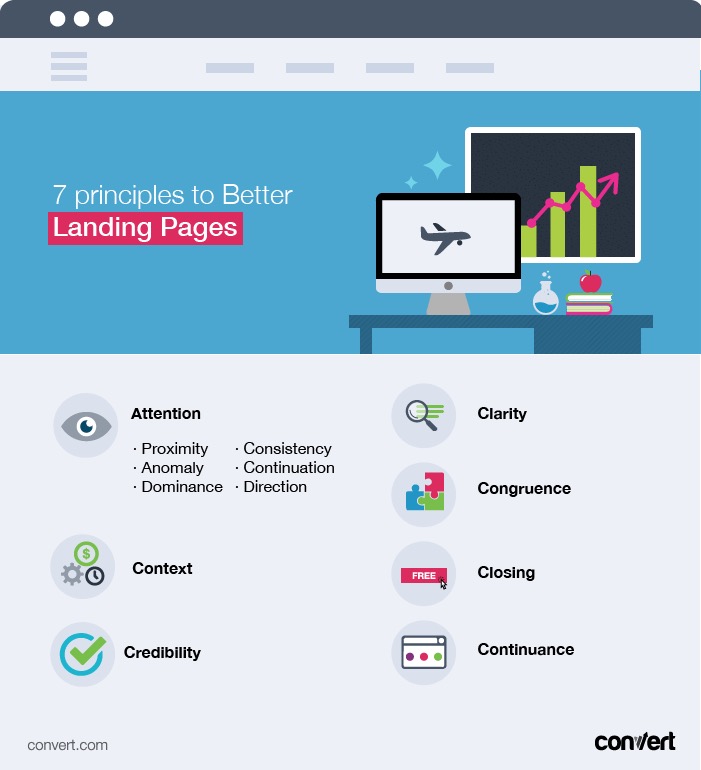
- Proximity – Elements close together are perceived as related
- Anomaly – Difference can indicate importance
- Dominance – The bigger, the more it stands out
- Consistency – Keep messaging on point throughout
- Continuation – Make your content tell a narrative story
- Direction – Make the colors and arrangement point to what’s important.
Put the most important information right at the top of the page about what they just did with a thank you or congratulations. Then, below try to get them into your next potential conversion, but only after you’ve followed through on the original goal of this campaign.
2. Context
Have someone who has not seen the landing page before answer each of these questions after glancing at the page. All yes answers means that you have created a perfectly clear page, and any no answers will help you zero in on the problem areas.
That idea of continuation, that your content should be telling a story, extends beyond the landing page itself. After all, the landing page is a continuation of some other form of lead gen, like emails, PPC ads, display ads, or Facebook shares.
Oli Gardner
Besides limiting the amount of superfluous attention grabbers on your landing page or CTA form, Gardner points out the following check list of design principles to keep in mind:
For Gardner, the place to start is your campaign goal, which should drive the content, design, and feel of your landing page. Beyond the exact wording of your call to action or your strategy for lead generation, what is your ultimate goal with this campaign? What information about the brand do you want people to discover? What do you want to learn about your potential customers in the process?
3.Clarity
High converting forms should include a headline, benefit to clicking through, the Call to Action itself, and a closing line. A great tip from Gardner is to take all of the content on your form and give it a score of 0 or 1. 0 means it is not directly related to your campaign goal, and 1 means that it is.
Gardner recommends accepting this above all – because users can sniff out a fake testimonial. So, silence is always preferable to lies.
- What the page is about
- What will happen if they click on the button/fill in the form
- Whether or not they should trust you
Take your form one more time and draw a circle around the call to action with a radius of 200 pixels. Everything in this range should be alleviating users’ impulse to click away. Especially the closing line.
Oli Gardner, the co-founder of Unbounce, claims to have seen more landing pages than anyone on the planet. That’s a bold claim, but after Convert heard his webinar covering the seven principles to conversion centered design, we were inclined to believe him. As Gardner walked webinar viewers through his expansive knowledge of what takes a landing page from creating friction with leads to becoming a purely delightful experience for all users, we picked up on the highlights and have collected them for you and your own conversion rate optimization below.
Building the perfect landing page for your campaign involves zeroing in on that CTA linked to your campaign goal, eliminating other options, putting it next to the most relevant information, making it bigger, keeping it in line with your brand, making it feel like the natural conclusion of your content, and even simply pointing at it directly. All of that is to say, you have a goal, and you need to do everything possible to make sure your site visitors see it clearly.
4. Congruence
In the meantime, try giving you service away to industry experts or bloggers. Once you have some solid, well-written feedback from them, you can include those testimonials until you’ve built up a good selection from current customers.
Gardner recommends a “five second test”. In five seconds, someone who does not have intimate knowledge of your brand should be able to determine:
An important question to ask yourself: is this landing page in context with where my visitors are landing from? Each of these different campaign strategies implies a certain level of trust. Emails mean that the visitor already has given out personal information and been won over at least a little by your efforts, but visitors clicking over from a PPC ad are going to be skeptical. Do your landing pages work to address these different attitudes?
Success of campaigns depends on how well you deliver on your pre-click promises.
5. Credibility
Just like how you want the landing page to feel like a natural continuation of the ad or email that brought them to your site, you want the click-through page after the form to reinforce that they’ve done the right thing and should have no regrets.
Once you have a campaign goal in place, you can start looking to all the different possibilities for directing site visitors’ attention to those ideas and achieving that goal. One mistake many sites make is relying too heavily on the Hobson’s plus one principle- the idea that it is always better to give users an option, making them feel like they had a choice before selecting the call to action.
Once you have copy that all scores one, you know you have congruence between your form and the rest of the landing page.
But, no matter how many you’ve seen, if you work to make yours fit your campaign goal by grabbing attention, keeping it in line with your brand, making your form user friendly and congruent with the rest of the campaign, and following through on your promises, you will start to see the benefits for your own conversion rates.
6. Closing
Related to context, but getting more specific, you want to ensure that design of forms really fits in with your goals. Creating a form to serve as just one part of the landing page creates incongruities with the branding, attention grabbing, and context. Instead, treat forms like they are the only thing on the page.
7. Continuance
Beyond delivering on promises, the design should also match. A Facebook share or an email should have the same color scheme, layout, and continuation of content in the landing page–that way the user knows they are in the right place with even less than a second of a glance.
One of the ways to help you achieve both attention-grabbing and contextual content is through making sure that it stays clear. Ask yourself: What is this page about and how long does it take to figure that out. The point has been made many times, but it can’t be underestimated: internet users and impatient. They want the big idea and they want it fast. Otherwise, they will move on.
Never start a campaign without a landing page, and never start a landing page without a campaign goal!
In theory that makes sense, but in practice reducing the amount of information and links on a form to an attention ratio of 1:1, meaning the thing you want the user to focus on is the only thing available, usually sees a conversion increase of 31%! By contrast, giving extra links or info next to the call to action has been, in Gardner’s experience, shown to result in a conversion decrease of -14%. It’s the classic design adage: less is more.
Don’t try to make your copy fit into a certain look or outline you have created, this is an easy way to create a confusing page. In Gardner’s experience, sites that wrote out strong copy first and then built the page to match it saw conversion increases of 30% or more!

