Mostly, though, displaying these badges can significantly improve your trustworthiness, and it can lead to an increase in sales. 17% of all online shoppers expressed their concerns when shopping online when it comes to security. This is why it’s crucial to appear more trustworthy to gain trust from customers.
Security badges and seals can make your site more trustworthy, and you can display them on your checkout page to earn more trust from customers. However, this method doesn’t work for everyone; in some cases, it provides unnecessary clutter that pollutes your checkout page and makes it more confusing.
In a yearly survey conducted by e-tailing, 92% of the users put A/B testing in second place as one of the most important tools for conversion rate optimization, behind web analytics.
What is the best way to display your checkout? As a one-page checkout, or in multiple pages? This is an important question to ask yourself when setting up an e-commerce checkout. You can get a good understanding of what your users think with a thorough A/B test. This Convert case study shows that among other things, we can contribute to an increase in conversions to up to 26% on a deal page with the help of CTAs!
Baymard Institute says that almost 70% of the customers who make it to the checkout page will abandon it at some point. The key is to reduce this number significantly, or at least, as much as possible.
Best A/B Tests for Checkout Pages and Their Implications
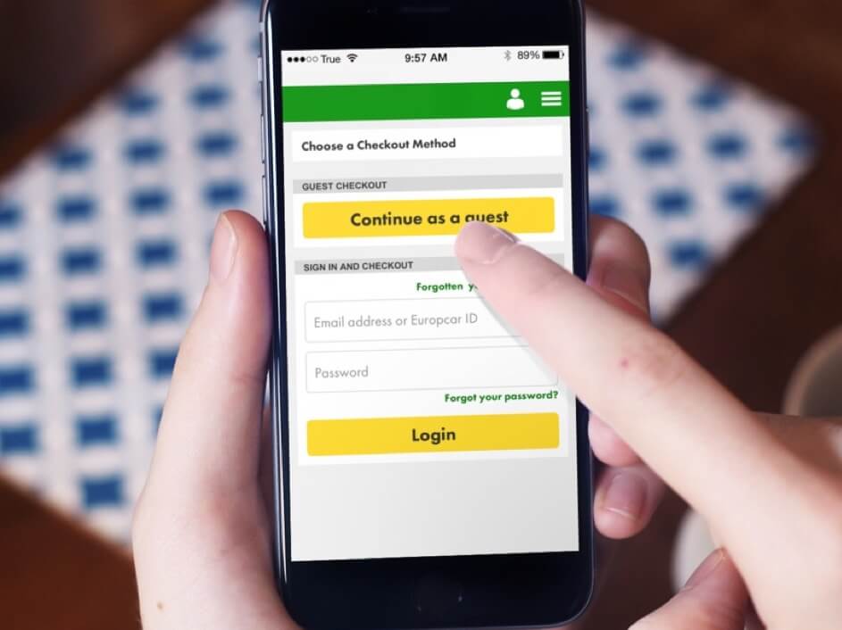
Usually, the best thing to do with e-commerce sites is to allow your customers to check out as guests, instead of forcing them to create an account.
1. Allowing Guest Checkouts vs. Requiring Membership

Setting up A/B tests requires a lot of thought of what you’re going to include in the testing, and how long you are going to do it for. There are great tools out there readily available.
With this testing, you’re investigating what CTA buttons work best, and where they are placed for the best results. For increasing conversions, having nicely designed CTA buttons is crucial, as is their placement. You can easily test their effectiveness on the checkout page with A/B testing.
But what about new customers? Do they want to go through the process of registering an account with you and filling out all the information before they make a purchase?
In a study, 56% of the responders said that a variety of payment options at check-out may encourage them to purchase in online shops.
Almost every site out there offers credit and debit card transactions, but it’s sometimes important to stay ahead of the competition and offer the means of payment that others don’t. For example, you can use cryptocurrency transactions or e-wallet transactions that other vendors don’t use, and use it to your advantage.
First, you’ll have to decide what page you’ll test. Run all analytics on the page and test it.
2. Single Page Checkouts vs. Multi-Page Checkouts
So it is more likely than these seals can help you out when it comes to conversion rate optimization on checkout pages.
Take a look at ASOS as an example. Their checkout page optimization has led them to have at least 50% more conversions, and far less cart abandonments, using A/B testing as well as other websites analytics tools.
One version of the test should offer checkouts without requiring an account, and the other should require the users to have an account before they complete a purchase.
This might seem like a very minor change, but it can bring massive results with it.
3. Displaying Your Security Badges vs. Not Displaying Them
In one test, have your checkout laid out as a simple, one-page checkout. The other version should have the checkout as a multi-page checkout that’s still simple and easy to follow. You will see what works best for your particular case, as not every page is the same in this regard.
A good risk-free method of finding out if it brings results is A/B testing. You can try offering 50% of your users your usual (credit/debit card, PayPal) payment methods, and the other 50% of your users your classic payment methods with a few additions (cryptocurrencies, Apple Pay, Stripe).
Member checkouts are especially useful for existing customers, as they want to check out fast and complete the purchase with just a few simple clicks or taps.
On the other hand, the negative side of this tactic is that it can turn off users as it’s on multiple pages. You can see what works best for you with an A/B test.
4. Call-to-Action A/B Testing
So you can see why you should test your CTA buttons. It’s one of the most important strategies of CRO.
But what exactly can you test, and what changes you can make between the two versions? Some of the factors include:
- The color of the CTA,
- Icons,
- The position of the CTA,
- The size of the CTA.
In this article, we’ll take a look at how A/B testing can boost your conversion rate and how you can implement A/B testing to improve your checkout page.
A/B testing is one of the best practices for CRO enthusiasts. If you’re looking to grow your conversions, flatten your bounce rates, and optimize your checkout page for your users, it’s a must. Don’t forget to use other analytics tools as well, as it can bring you much better results when used in combination.
Additionally, offering checkouts through various other payment platforms can also prove beneficial. PayPal comes to mind as the biggest platform out there, but others also come into play like Stripe or Apple Pay. Sometimes, the width of the payment option is important, as is the quality.
5. Payment Methods A/B Testing
This is a tactic that ASOS used to increase their conversions by almost 50%. Guest checkouts have worked for them, and they can also work for you. However, it’s still better to do some testing before you implement any change.
To understand A/B testing better in correlation to checkout pages, it’s considerable to take a look at specific practices and examples that have been proven to work in the past. Several companies have seen big success with some of these A/B tests, and there’s no reason why you shouldn’t try them.
Baymard also conducted a survey that tested which security seal makes you appear more trustworthy. The indisputable winner was the Norton seal, with more than 35.6% of all votes.
The payment methods you offer on the checkout page can play a significant role in establishing and improving your CRO game.
It’s an astonishing feat, but A/B tests truly deserve the spot on the list. For some, they are just as important as web analytics, if not even more important.
How to Set Up A/B Tests?
In e-commerce, there are few pages more important than the actual checkout page. That’s where most people end up deciding whether they’ll buy your products or not. You’ve done a good job bringing them to your checkout page. The challenge now is to get the customers to complete the purchase. Have an A/B test and see the results for yourself. Most sites see better results if they enable guest checkouts.
- Then, you’ll have to come up with a better version of the site. You can use one of the methods we discussed here.
- Next comes the testing itself. Display both versions to a variety of users for the best results.
- Lastly comes the analysis of the results and the selection of the best version.
Conclusion
For example, Typeform uses a multi-page checkout with several simple, centered pages during the checkout. It can be an effective tactic to reduce the checkout times, even though it’s laid out over several pages.


![What’s New With MobiusX [Release Notes – Q3 2021]](https://research-institute.org/wp-content/uploads/2021/04/what-to-know-before-you-sell-your-small-business-768x432.png)


