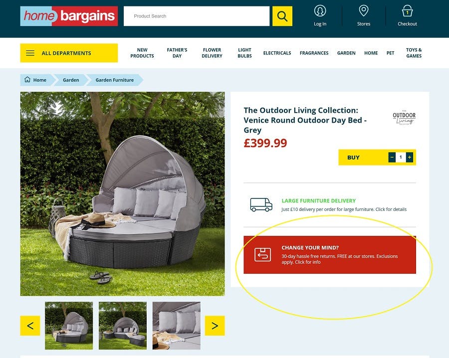
The Home Bargains website is among the most basic in this list, but there are some elements worth noting. First is its promotion of returns, which is often absent among discount retailers (with many choosing to prioritise delivery instead).
It’s clear that a robust ecommerce offering helped many a retailer get through the Covid-19 pandemic, where even amongst booming categories like Home, store restrictions and closures initially impacted sales. And even if ecommerce penetration dips back to pre-pandemic levels for the foreseeable future, many retailers across the board are focusing on ecommerce profitability by taking a more pragmatic stance in areas such as home delivery charges and returns policies.
Like B&M, Aldi’s website clearly labels which products are available to order online, as well as those in its ‘Specialbuys’ category that are currently available with free delivery. This additional perk is bound to drive orders, but its bold blue label (which is hard to miss on product pages) is particularly effective.
Home Bargains: a focus on returns
Ecommerce Best Practice Guide
Wilko’s website stands out amongst budget retailers, which can often have fairly sparse sites. Its product pages, for example, include comprehensive reviews, detailed descriptions, as well as handy product bundles, and links to ideas and advice.
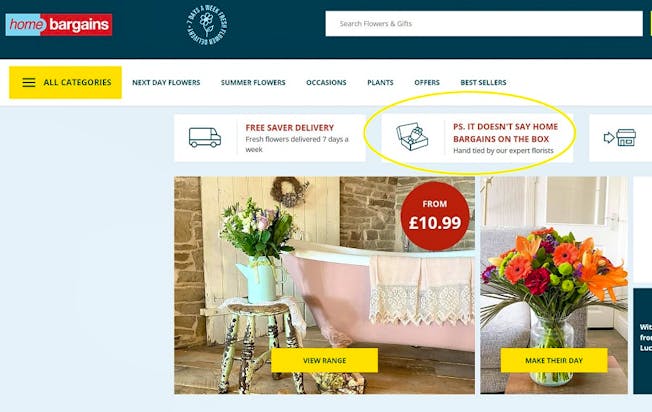
Home Bargains Flowers: “it doesn’t say Home Bargains on the box”
The reassurance that “it doesn’t say Home Bargains on the box” is a clever touch.
Aldi rolled out its click-and-collect service in early 2021, but it has been selling online for a number of years, beginning with wine by the case in 2016. The retailer also added an ‘online home store’ (a new section of its existing ecommerce website) in late 2021.
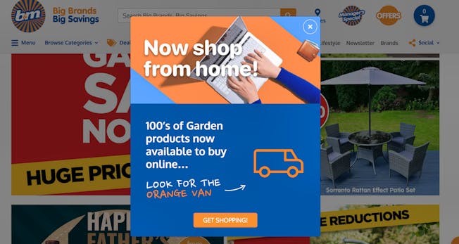
B&M: ‘look for the orange van’ labelling
Another nice touch is a next-day delivery countdown, which gives shoppers an indication of how long they’ve got left to qualify for next day delivery (this disappears on Fridays, reverting to ‘our fastest delivery’ after the weekend). Another effective element is Wilko’s dedicated ‘Offers’ tab on its homepage, which effectively promotes its money-saving angle online, driving purchases that are on sale or reduced to clear.
Home Bargains puts ‘hassle-free returns’ as a USP on its homepage, as well as on its product pages, where it highlights that items are free to return in stores within 30 days.
Poundshop.com: bundle add-to-cart
Poundland shuttered its own nascent ecommerce website, which launched in 2021, and the Poundshop.com website now sells Poundland’s private label ranges like PEP&CO Home.
The majority of B&M’s offering remains in-store only, however, the budget retailer has recently started selling its garden category online.
At a time of inflationary pressures and increased cost of living, customers may be seeking out these options more readily online. So how do these retailers encourage conversion amongst shoppers who may be new to purchasing in this category online?

Here’s a look at some UX features across the ecommerce websites of Aldi, B&M, Home Bargains, Poundland/Poundshop.com, Primark, Savers and Wilko.
Poundshop.com: cheaper delivery, the more you spend
B&M aims to avoid any confusion over what consumers can buy online (or not, as is mostly the case) by clearly instructing online shoppers to ‘look for the van’, with all garden items plainly marked for online delivery. B&M also currently drives awareness of its new online category through the promotion of a big garden sale.

Aldi: ‘free delivery’ flashes
Consumer spend on personal care products surged during Covid, also leading to heightened competition in this space from retailers ranging from Boots to FeelUnique. Savers, which launched its ecommerce proposition in 2019, aims to fulfil the demand for lower-priced health and beauty products, offering consumers affordability as well as convenience with its online shop.
An increasing number of discount stores have invested in ecommerce in the last few years, often providing home delivery only for higher-priced items, or for minimum order values.
User Experience and Interaction Design

Savers: curated categories
One product category that caught my eye on the Home Bargains website header menu was ‘flower delivery’, which is certainly something that differentiates it from its discount competitors. Click and you’re taken to homebargainsflowers.co.uk, shown below, which is operated by Prestige Gifting.
One thing Savers does effectively on its website is to inspire shoppers with curated categories which centre around a theme or topic. Take its current example, ‘Sun & Holiday’, which pulls together items (from various categories) that someone might need during the summer or when going abroad. This makes shopping online easier for customers, also tempting them into buying additional items that they might not have initially intended to buy.

Wilko: comprehensive content
Poundland acquired discount retailer Poundshop.com in March this year, saying it “will provide the infrastructure to power a national roll-out of its own pilot ecommerce operation.”

You’ll notice Aldi also creates a sense of urgency with social proof, using pop-up banners that tell the shopper how many people are looking at the item or have added it to their basket in the past 24 hours.

Is ecommerce inevitable for discounters?
Stand-out UX features on Poundshop.com’s “tried and tested” platform include bundle suggestions on product pages, which show customers three products ‘often bought together’ along with a clear price and singular ‘add to cart’ button. This effectively encourages customers to bump up their basket value (where the minimum order is £10).
Clearly, a multichannel strategy allows discount retailers to more effectively build their brand and activate sales online, but the bottom line has to work. With Primark adding a store availability checker to its website recently, to better enable ROPO (research online, purchase offline) perhaps the well-known ecommerce holdout will decide to trial home delivery in future. That would certainly feel like a turning point.
Poundshop.com upsells on delivery, too, using a tiered system that offers cheaper delivery the more that customers spend. For example, a minimum order of £10 means standard delivery is £5.95, while this is reduced to £3.95 on a £30 shop, and just £1 on a £40 shop. A nice incentive to increase that order value.